17 KiB
| created_at | title | url | author | points | story_text | comment_text | num_comments | story_id | story_title | story_url | parent_id | created_at_i | _tags | objectID | year | |||
|---|---|---|---|---|---|---|---|---|---|---|---|---|---|---|---|---|---|---|
| 2016-04-14T00:33:22.000Z | Don’t design like a programmer (2010) | http://www.uxdesignedge.com/2010/03/dont-design-like-a-programmer/ | panic | 113 | 52 | 1460594002 |
|
11493504 | 2010 |
Don’t design like a programmer – User Experience Design Training & Consulting--UX Design Edge User Experience Design Training & Consulting–UX Design Edge
-
UX Design Edge
-
* [Home][1] -
Blog
-
Recent Posts
-
Popular Posts
- Don't design like a programmer
- Personas: Dead yet?
- Intuitive UI: What the heck is it?
- How to ask good design interview questions—and why "design a spice rack for blind people" isn't one of them
- Why "everybody is a designer": The UX Design Skills Ladder
- Are you sure? How to write effective confirmations
- Design scenarios—and how thrilled users ruin them
- Interaction design interview question #1
- Don't design like a programmer, part 3
- Don't design like a programmer, part 2
- The politics of ribbons
- Design Hacking: Great UX without time, money, or design skills
Home » [2010][23] » [03][24]Don't design like a programmer – User Experience Design Training & Consulting--UX Design Edge
- By [Everett McKay][25] on March 29th, 2010
- Getting started in design
Don't design like a programmer
![][26]I sometimes say that UI looks like it was “designed by a programmer." This isn't some arbitrary remark—rather this is my cute way of describing a class of UI design mistakes that programmers are particularly prone to make. Contrary to claims made by Alan Cooper, I don't think this style of UI is the result of some programmer conspiracy to inflict their ill will over hapless users. Rather, these designs happen because programmers find them easier to develop, don't notice their usability problems, and often aren't aware that there are better solutions.
**New! **By popular demand, I have posts that show what a good design looks like and how to get it. Please check [Don't design like a programmer, part 2][27] for a design process and [Don’t design like a programmer, part 3][28] for the new design.
These designs usually stem from directly mapping a data structure into a UI and expecting the result to be usable. To see what I mean, let's assume that we have a data structure like this:
     struct UserOptions {


          bool        Option1;


          bool        Option2;


          String      Option3:


          String      Option4:


          ...


     };
It's natural to assume that a good UI might look something like this:
![][29]
Now all you have to do is present this UI to the user, have the user provide all the information, and continue. Pretty straightforward, right?
While sometimes this approach works just fine, all too often it leads to a poor experience. Here are some of the reasons:** **
Data structure issues
- Using variable or technology names as control labels The variable names work fine for the code, so why not use the same or similar names in the UI? The problem is that these names, often based on technology, may not be all that meaningful to users. Devices properties and settings are full of examples. For example, how many users know that "duplex printing" means print on both sides of the paper?
**Warning sign: **Control labels based on technology rather than purpose. - Letting variable types determine control types The common data types of strings, integers, and Booleans readily map into text boxes, radio buttons, and check boxes. The problem is text boxes, being the most unconstrained control, require the most knowledge and effort for users. Mapping to richer, more constrained controls takes more effort for programmers.
**Warning sign: **Overuse of text boxes and check boxes. - Exposing raw, unformatted data It's much easier to expose raw data than to translate it into a format that is more meaningful or natural to users. For example, it's easier to expose a raw date than a properly formatted date for the user's locale. It’s easier to display a plain date than the useful, relevant information behind the date (such as days until deadline, age when an event occurred, etc.) Likewise, raw data like "1KNG 1BDRM EVO STE NSM" is easier to display than the more comprehensible "Evolution Suite with 1 King Bed (non-smoking)."
- **Warning sign: **Controls display raw, unformatted data that requires users to translate.
- **Exposing representation invariants **In object-oriented programming, a representation invariant is a set of constraints that a concrete data type must uphold to correctly represent an abstract data type. Simply mapping a data structure to a UI would expose the invariant and put the burden of enforcing the invariant on users instead of the code. A typical example is having to enter a phone or part number in a specific format instead of the program handling any reasonable input.
Warning sign: Users required to enter data using a specific format. - Exposing special values A common programming practice is to assign special meanings to a special value, so, for example, a value of -1 might mean "not available" or "unassigned". Simply mapping a data structure to a UI exposes these special values (typically through the control label), requiring users to know and enter them.
**Warning sign: **Control labels that explain special values. - Overusing error messages A related problem is display error messages for the slightest input problem, regardless of how clear the user's intent or easy the problem is to correct.
Warning sign: Use of error messages for easy-to-correct input problems.
Simplicity issues
- Not optimizing for the probable While from the code's point of view any input is possible, from the user's point of view not all input is equally likely. For example, while users could select any font, most likely users are going to select the last font, a recently chosen font, or a font chosen in the past.
Warning sign: Not optimizing for the most likely input. - Over generalizing (the 0, 1, n problem) Programmers handle the absence or presence of something with a simple if statement, but handling 2 or more things requires a for loop. Exposing this generalization often leads to unnecessary complexity. From the programmer's point of view, if you are going to design code to support a family, you might as well support a commune too. From the UX perspective, it's far better to optimize for the common cases.
Warning sign: Not optimizing for the most common number of objects. - Asking for what the code needs vs. what the user knows What the code needs and what the user knows might not be the same. For example, the program might want an airport code, but the user might know the city. Or the program might want the telephone exchange code, but the user might not know what that is (it's the three digits after the area code). While it's easier to present what the program needs directly, it's better to ask for input that users can provide easily and confidently.
Warning sign: Users have to look up information or need to use help to provide input.
Life cycle issues
- **Having baffling initialization **Have you ever seen a large form where everything was initially blank and you had no clue what to do to get started? While zeroing out everything is a fine way to initialize a data structure, sometimes users need more than a blank form to get going.
**Warning sign: **Initial UI state is blank and difficult to figure out. - Going all in Data structures reflect data types and hierarchies, but they reflect little else—they don't reflect dependencies between members, or important vs. unimportant or required vs. optional values. Mapping a data structure directly to a UI would present all the data at once, without showing dependencies or optional values, or using progressive disclosure to hide infrequently used settings.
**Warning sign: **All input is always displayed and always required, even if unimportant, optional, or dependent on other settings. - Having all or nothing Similarly, while all elements might belong together in a data structure, they don't necessarily have to be provided by the user all at the same time. Mapping a data structure directly to a UI would require the user to provide all the information before proceeding, whereas a better experience would be to let the user proceed with the task with only the minimum amount of information, and gathering the remainder only when needed.
**Warning sign: **Input is requested well before it is necessary.
Efficiency issues
- Having a privacy hurdle If the data structure needs personal information or information that is difficult to obtain (such as having an account, finding an account name or password), users might be unwilling to provide such information—especially if such information shouldn't be required to perform (or at least initiate) the task.
**Warning sign: **Users are required to have accounts, log on, or provide personal information unnecessarily. - **Avoiding excise **Even if all the other factors work out, the UI could be annoying if displayed every time a frequent action is performed. Frequent actions should be designed to reduce or eliminate any hurdles, typically by assuming reasonable default values.
**Warning sign: **Frequently performed tasks present an unnecessary dialog box instead of assuming defaults. - Handling scale Mapping a data structure directly to a UI might work well for a few variables, but the resulting UI can be a nightmare for dozens.
Warning sign: Way too many controls displayed on a single screen. - Handling unexpected input Just because you don’t expect input in a certain format or find that format inconvenient doesn’t mean it’s wrong. If the user believes the input is valid, it almost certainly is. Check [We cannot accept that behavior][30] for an unpleasant but all-too-common example.
Warning sign: Unnecessary restrictions on input formats.
**If you do only one thing: ** Think about UI as a means for users to achieve their goals and perform their tasks, not as a means to fill in data structures or make code happy. Poorly designed UI requires users to translate their goals into what the UI needs, whereas well designed UI does this translation for them. What at first appears to be easy and obvious UI design may prove to be a poor experience from the user's point of view.
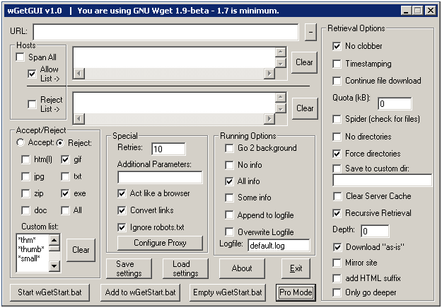
A challenge
How many of the above problems can you spot below?
![][31]
Yup—this looks like it was designed by a programmer. For starters, notice how nearly all the controls are text boxes and check boxes because they map directly to the underlying data structure. While this UI has problems outside of those mentioned in this post (such as poor communication, task flow, and layout), fixing the core problems first will make other problems easier to solve.
Want to see how to do it right? Check out [Don't design like a programmer, part 3][28].
A bonus challenge
The User Options example has 6 minor guideline compliance problems. Can you find them?
Want to learn more? Check out UX Design Essentials and UX Design Basics
If you would like to learn how design UIs the right way, please consider taking my [UX Design Essentials][32] course or my online [UX Design Basics][33] course. I've designed both of these courses to help non-designers get started in UX design. I've only scratched the surface here.
←[ Previous Post][34] [Next Post →][35]
-
[42 Comments »][36]**
-
[Getting started in design][37]
The comments are closed.
Upcoming Training Dates
Free webinars
March 9, 2018 11 am EST [Lean-er Personas—Learning from your users without wasting time][38]
April 20, 2018 11 am EST [Designing for trust and confidence][39]
May 11, 2018 11 am EST [Why your Dashboards suck—and what to do about it][40]
June 22, 2018 11 am EST [Practical simplicity: What it is, how to get, it, and how to get your team to embrace it][41]
[More dates >>][42]
Recent blog post ![][43] [Subscribe][44]
[Best Wishes for 2017 from UX Design Edge
][45]
Contact
UX Design Edge - [info@uxdesignedge.com][25]
Newsletter Sign-up
Name:
Email:
Your email is private and will not be shared
For more information, please contact [info@uxdesignedge.com][25]
All Content Copyright © UX Design Edge
[23]: [24]: /03 [25]: mailto:info%40uxdesignedge.com [26]: http://www.uxdesignedge.com/wp-content/uploads/2010/03/programmer.png "Programmer" [27]: http://www.uxdesignedge.com/2011/06/don%E2%80%99t-design-like-a-programmer-part-2/ [28]: http://www.uxdesignedge.com/2011/11/don%E2%80%99t-design-like-a-programmer-part-3/ [29]: http://www.uxdesignedge.com/wp-content/uploads/2010/03/user-options.png?w=300 "User Options" [30]: http://www.cooper.com/journal/2009/09/we_cannot_accept_that [31]: http://www.uxdesignedge.com/wp-content/uploads/2010/03/idontseetheproblem1.png "IDontSeeTheProblem" [32]: http://www.uxdesignedge.com/training/user-experience-design-essentials/ux-design-essentials-curriculum/ [33]: http://www.uxdesignedge.com/training/ux-design-basics/ [34]: http://www.uxdesignedge.com/2010/03/getting-started-in-interaction-design/ [35]: http://www.uxdesignedge.com/2010/04/how-to-ask-good-design-interview-questions/ [36]: http://www.uxdesignedge.com/2010/03/dont-design-like-a-programmer/#comments [37]: http://www.uxdesignedge.com/category/getting-started-in-design/ [38]: https://attendee.gotowebinar.com/register/8898592080960396545 [39]: https://attendee.gotowebinar.com/register/7193974124442548993 [40]: https://attendee.gotowebinar.com/register/836019549525536001 [41]: https://attendee.gotowebinar.com/register/3623204560123774977 [42]: http://freeuxwebinars.com/ [43]: http://www.feedburner.com/fb/images/pub/feed-icon16x16.png [44]: http://feedburner.google.com/fb/a/mailverify?uri=UXDesignEdgeBlog&loc=en_US "Subscribe to my feed" [45]: http://www.uxdesignedge.com/2017/01/best-wishes-2017-ux-design-edge/ "Best Wishes for 2017 from UX Design Edge"