11 KiB
| created_at | title | url | author | points | story_text | comment_text | num_comments | story_id | story_title | story_url | parent_id | created_at_i | _tags | objectID | year | |||
|---|---|---|---|---|---|---|---|---|---|---|---|---|---|---|---|---|---|---|
| 2015-11-10T09:42:53.000Z | The Scourge of Arial (2001) | http://www.marksimonson.com/notebook/view/the-scourge-of-arial | rangibaby | 45 | 26 | 1447148573 |
|
10538384 | 2001 |
The Scourge of Arial - Mark Simonson
![]()
Search the notebook
The Scourge of Arial
February 21st, 2001
Arial is everywhere. If you don’t know what it is, you don’t use a modern personal computer. Arial is a font that is familiar to anyone who uses Microsoft products, whether on a PC or a Mac. It has spread like a virus through the typographic landscape and illustrates the pervasiveness of Microsoft’s influence in the world.
Arial’s ubiquity is not due to its beauty. It’s actually rather homely. Not that homeliness is necessarily a bad thing for a typeface. With typefaces, character and history are just as important. Arial, however, has a rather dubious history and not much character. In fact, Arial is little more than a shameless impostor.
Throughout the latter half of the twentieth century, one of the most popular typefaces in the western world was Helvetica. It was developed by the Haas Foundry of Switzerland in the 1950s. Later, Haas merged with Linotype and Helvetica was heavily promoted. More weights were added and it really began to catch on.
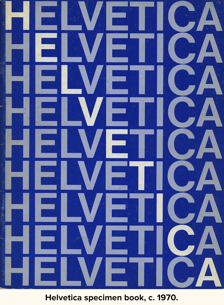
An icon of the Swiss school of typography, Helvetica swept through the design world in the ’60s and became synonymous with modern, progressive, cosmopolitan attitudes. With its friendly, cheerful appearance and clean lines, it was universally embraced for a time by both the corporate and design worlds as a nearly perfect typeface to be used for anything and everything. “When in doubt, use Helvetica” was a common rule.
As it spread into the mainstream in the ’70s, many designers tired of it and moved on to other typographic fashions, but by then it had become a staple of everyday design and printing. So in the early ’80s when Adobe developed the PostScript page description language, it was no surprise that they chose Helvetica as one of the basic four fonts to be included with every PostScript interpreter they licensed (along with Times, Courier, and Symbol). Adobe licensed its fonts from the original foundries, demonstrating their respect and appreciation for the integrity of type, type foundries and designers. They perhaps realized that if they had used knock-offs of popular typefaces, the professional graphic arts industry—a key market—would not accept them.
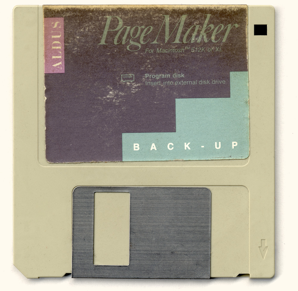
By the late eighties, the desktop publishing phenomenon was in full swing. Led by the Macintosh and programs like PageMaker, and made possible by Adobe’s PostScript page description language, anyone could do near professional-quality typesetting on relatively inexpensive personal computers.
But there was a problem. There were two kinds of PostScript fonts: Type 1 and Type 3. Type 1 fonts included “hints” that improved the quality of output dramatically over Type 3 fonts. Adobe provided information on making Type 3 fonts, but kept the secrets of the superior Type 1 font technology to itself. If you wanted Type 1 fonts, Adobe was the only source. Anyone else who wanted to make or sell fonts had to settle for the inferior Type 3 format. Adobe wanted the high end of the market all to itself.
By 1989, a number of companies were hard at work trying to crack the Type 1 format or devise alternatives. Apple and Microsoft signed a cross-licensing agreement to create an alternative to Adobe’s technology. While Microsoft worked on TrueImage, a page description language, Apple developed the TrueType format. TrueType was a more open format and was compatible with—but not dependent on—PostScript. This effectively forced Adobe’s hand, causing them to release the secrets of the Type 1 format to save themselves from irrelevancy.
Around the same time, PostScript “clones” were being developed to compete with Adobe. These PostScript “work-alikes” were usually bundled with “look-alike” fonts, since the originals were owned by Adobe’s business partners. One PostScript clone, sold by Birmy, featured a Helvetica substitute developed by Monotype called Arial.
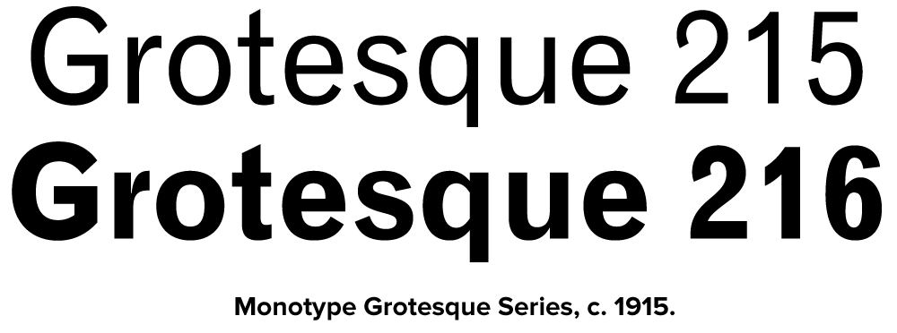
Arial appears to be a loose adaptation of Monotype’s venerable Grotesque series, redrawn to match the proportions and weight of Helvetica. At a glance, it looks like Helvetica, but up close it’s different in dozens of seemingly arbitrary ways. Because it matched Helvetica’s proportions, it was possible to automatically substitute Arial when Helvetica was specified in a document printed on a PostScript clone output device. To the untrained eye, the difference was hard to spot. (See “How to Spot Arial”) After all, most people would have trouble telling the difference between a serif and a sans serif typeface. But to an experienced designer, it was like asking for Jimmy Stewart and getting Rich Little.
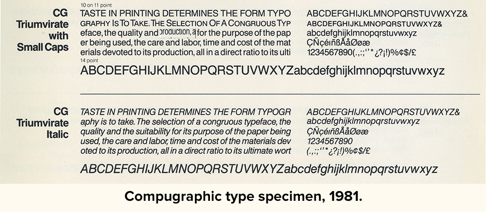
What is really strange about Arial is that it appears that Monotype was uncomfortable about doing a direct copy of Helvetica. They could very easily have done that and gotten away with it. Many type manufacturers in the past have done knock-offs of Helvetica that were indistinguishable or nearly so. For better or worse, in many countries—particularly the U.S.—while typeface names can be protected legally, typeface designs themselves are difficult to protect. So, if you wanted to buy a typesetting machine and wanted the real Helvetica, you had to buy Linotype. If you opted to purchase Compugraphic, AM, or Alphatype typesetting equipment, you couldn’t get Helvetica. Instead you got Triumvirate, or Helios, or Megaron, or Newton, or whatever. Every typesetting manufacturer had its own Helvetica look-alike. It’s quite possible that most of the “Helvetica” seen in the ’70s was actually not Helvetica.
Now, Monotype was a respected type foundry with a glorious past and perhaps the idea of being associated with these “pirates” was unacceptable. So, instead, they found a loophole and devised an “original” design that just happens to share exactly the same proportions and weight as another typeface. (See “Monotype’s Other ‘Arials’”) This, to my mind, is almost worse than an outright copy. A copy, it could be said, pays homage (if not license fees) to the original by its very existence. Arial, on the other hand, pretends to be different. It says, in effect “I’m not Helvetica. I don’t even look like Helvetica!”, but gladly steps into the same shoes. In fact, it has no other role.
When Microsoft made TrueType the standard font format for Windows 3.1, they opted to go with Arial rather than Helvetica, probably because it was cheaper and they knew most people wouldn’t know (or even care about) the difference. Apple also standardized on TrueType at the same time, but went with Helvetica, not Arial, and paid Linotype’s license fee. Of course, Windows 3.1 was a big hit. Thus, Arial is now everywhere, a side effect of Windows’ success, born out of the desire to avoid paying license fees.
The situation today is that Arial has displaced Helvetica as the standard font in practically everything done by nonprofessionals in print, on television, and on the Web, where it’s become a standard font, mostly because of Microsoft bundling it with everything—even for Macs, which already come with Helvetica. This is not such a big deal since at the low resolution of a computer screen, it might as well be Helvetica. In any case, for fonts on the Web, Arial is one of the few choices available.
Despite its pervasiveness, a professional designer would rarely—at least for the moment—specify Arial. To professional designers, Arial is looked down on as a not-very-faithful imitation of a typeface that is no longer fashionable. It has what you might call a “low-end stigma.” The few cases that I have heard of where a designer has intentionally used Arial were because the client insisted on it. Why? The client wanted to be able to produce materials in-house that matched their corporate look and they already had Arial, because it’s included with Windows. True to its heritage, Arial gets chosen because it’s cheap, not because it’s a great typeface.
It’s been a very long time since I was actually a fan of Helvetica, but the fact is Helvetica became popular on its own merits. Arial owes its very existence to that success but is little more than a parasite—and it looks like it’s the kind that eventually destroys the host. I can almost hear young designers now saying, “Helvetica? That’s that font that looks kinda like Arial, right?”
See also:
How To Spot Arial
Monotype’s Other “Arials”
Filed Under: Type Industry, Type History
 Permalink
![]() ** Mark Simonson Studio**
** Mark Simonson Studio**
© 2018